Written by Katie Russell, Content Team Lead, Harvest Group
We’ve all heard the saying that a picture is worth a thousand words, and in the world of digital commerce it couldn’t be more true. Each retailer item page is comprised of many of the same details: Title, Description, Bullet Features, and Images. While the makeup of each portion has different requirements based on the retailer, the same holds true – people focus on the pictures. Detailed below you’ll find information about what makes up an image carousel, tips for creating a useful and powerful carousel, and how to go about creating one.
What are Carousel Images and Why Do You Need Them?
Carousel images are located at the top of an item page near the title for the majority of retailer sites. They are one of the first things a shopper will notice when they click into an item page, along with the title, price, and average rating.
Seeing an image carousel generally requires no scrolling, which means shoppers are likely to almost immediately see 3-4 images without having to take any action. Because it shows up first thing in front of the shopper, it’s important to cultivate a carousel that conveys important information about the item quickly and in an aesthetically engaging way.
Few shoppers take the time to scroll down and view Enhanced/A+ Content on a page because of how far down it is compared to the title and images. The shopper simply clicks on the ratings/reviews to immediately be taken to that part of the page.
This also means your description and bullet features which help to explain why the shopper should buy the product aren’t read by many viewers. At the end of the day, written content speaks to the algorithm and helps your item SHOW UP on the search page while your image carousel and ratings/reviews are what help to CONVERT the shopper.
3 Tips for Strong Image Carousels
1. View Your Product Images with Your “Instagram” Eyes
Imagine yourself scrolling through Instagram. What catches your attention and makes you pause? This is what you should think as you build out the assets for your image carousel. Images should be attractive, fun, and eye-catching while remaining in the scope of your brand. They should create a feeling about your brand and product that the consumer is drawn to emotionally.
2. Place Your Carousel Images in Order Strategically
While the first image should always be the item itself, every space after that should be thought through and each image strategically placed in the carousel. Does the back of pack image have to be the second image? If so, why? Could another image be more beneficial to the shopper in the second spot? Probably.
These are the questions to be considered when planning out an image carousel, and the right strategy for one brand isn’t necessarily the right strategy for another. Think through your top selling points of the item and build out informative assets that efficiently communicate each one. Then, choose the order in which they should show (typically the most important selling point should come first).
3. Use Your Carousel to Include the Top Selling Points for Your Product
Each image should convey a message, whether it be the texture of the item, how someone uses it, or why it’s helpful to have. It is important to note that Target and Costco, specifically, do not allow any words on images outside of packaging, so brands have to rely on lifestyle images for those retailer item pages.
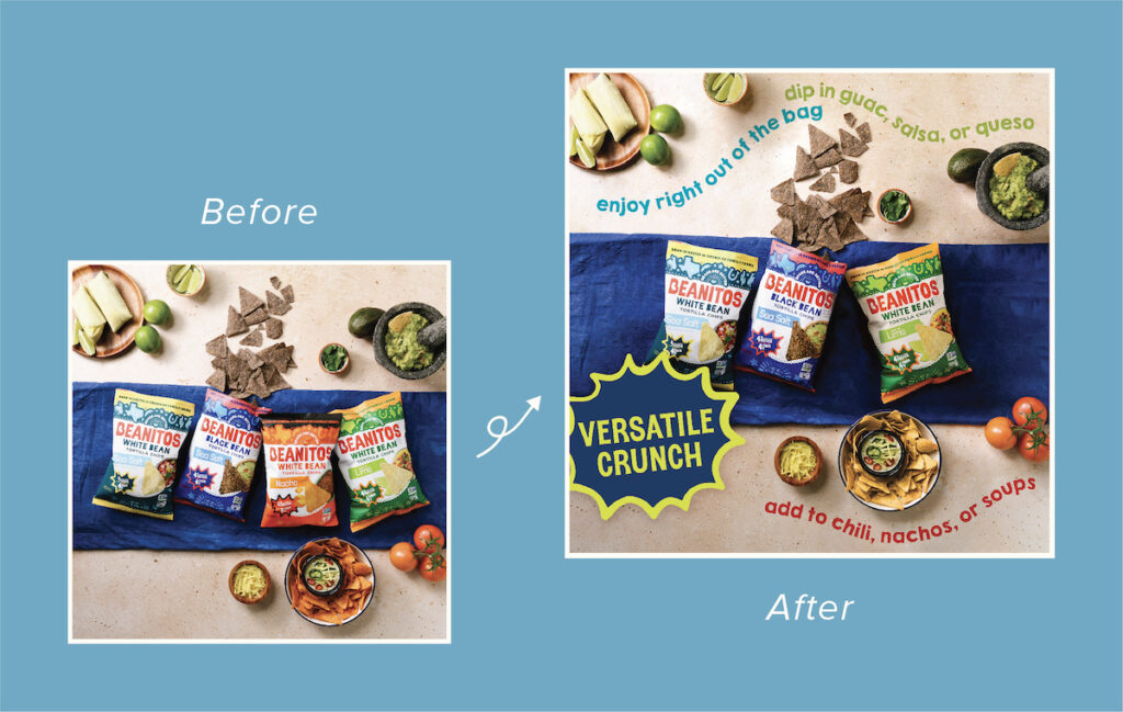
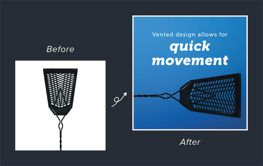
Other retailers like Walmart, Amazon, and Kroger allow words on images, allowing you the opportunity to develop informative graphics to communicate top sell points to the shopper. By including brief verbiage on eye-catching images, you’re easily communicating to the shopper the top reasons to buy your item. Because shoppers are more likely to scroll images than to scroll down and read the description and features, adding words to images is an effective way to let the shopper know exactly what you want them to know to make the purchase.
Examples – Before and After Harvest Group Creative Services
- See the Beanitos Amazon Item Page with Image Carousel Here
- See the Enoz Fly Swatter Amazon Item Page with Image Carousel Here
So How Do I Create Great Carousel Images?
Many brands have an in-house creative team to build graphics and design images. By showing examples of what you see from your top competitors (or items you think have strong carousels), your creative team can get an idea of what they need to make for each item’s specific carousel.
If your brand doesn’t have an in-house creative team, outsourcing is always a great way to get the few images you need per item to build out the carousel. Harvest Group has in-house design services and works closely with clients to create brand-focused informative images to ensure their items have the strongest carousel possible. If you’re interested in learning more about Harvest Group’s Content Services, reach out to us at hello@harvestgroup.com or fill out our Contact Us form here.


